Tilda is a sales consultancy in New York City. I assisted the creative director on Tilda’s visual identity and web layout when I was at Butter Studio. We helped Tilda launch their firm and, in turn, fostered their mission to grow more businesses. We developed their company name, brand strategy, visual identity, website, and social graphics. See it for yourself in action, visit the website. The website has won two Awwwards: Honors and Mobile!
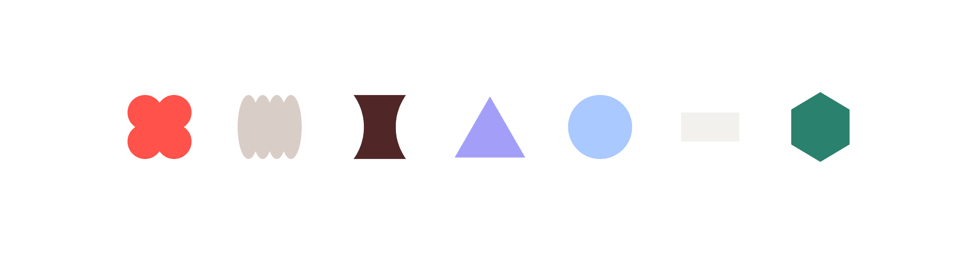
The Concept: The name 'Tilda' is short for 'Matilda,' and despite our 90's Roald Dahl nostalgia, actually means "mighty in battle," in Latin. The tone of the name we developed for this Brooklyn-based consultancy is strong but soft and feminine. A mix of trustworthy and established, but fresh and unexpected. The typeface we used for the logo, called Platform, has a wide 'D' and 'A', giving the sense that the word is expanding to the right, which reflects the core of Tilda's services: helping businesses grow. The brand mark and a stacked variation of the logo are built on the same concept of 'up and to the right, growth'. We also developed a series of photo collages combining shapes with images of inspiring cities and powerful natural landscapes. The result is an overarching tone of potential and scaling new heights.
The Concept: The name 'Tilda' is short for 'Matilda,' and despite our 90's Roald Dahl nostalgia, actually means "mighty in battle," in Latin. The tone of the name we developed for this Brooklyn-based consultancy is strong but soft and feminine. A mix of trustworthy and established, but fresh and unexpected. The typeface we used for the logo, called Platform, has a wide 'D' and 'A', giving the sense that the word is expanding to the right, which reflects the core of Tilda's services: helping businesses grow. The brand mark and a stacked variation of the logo are built on the same concept of 'up and to the right, growth'. We also developed a series of photo collages combining shapes with images of inspiring cities and powerful natural landscapes. The result is an overarching tone of potential and scaling new heights.
Tilda – An Unconventional Consultancy
Visual Identity / UX/UI
Agency: Butter Studio
Role: Designer
Year: 2020
Visual Identity / UX/UI
Agency: Butter Studio
Role: Designer
Year: 2020

Agency: Butter Studio
Creative Director: Cari Sekendur
Designer: Bao Hu, Mi Chen, Hannah Ahn, Cari Sekendur
Web Development: Lattimore & Friends
Year: 2020