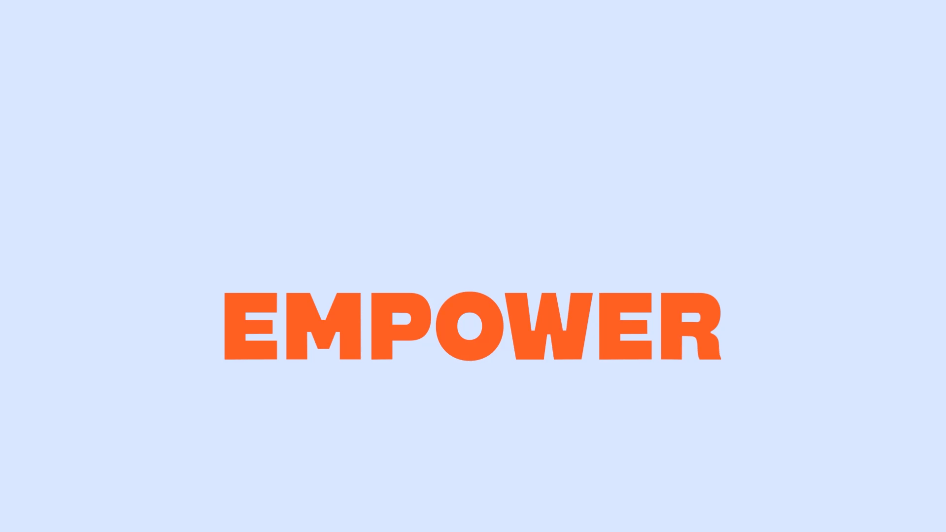
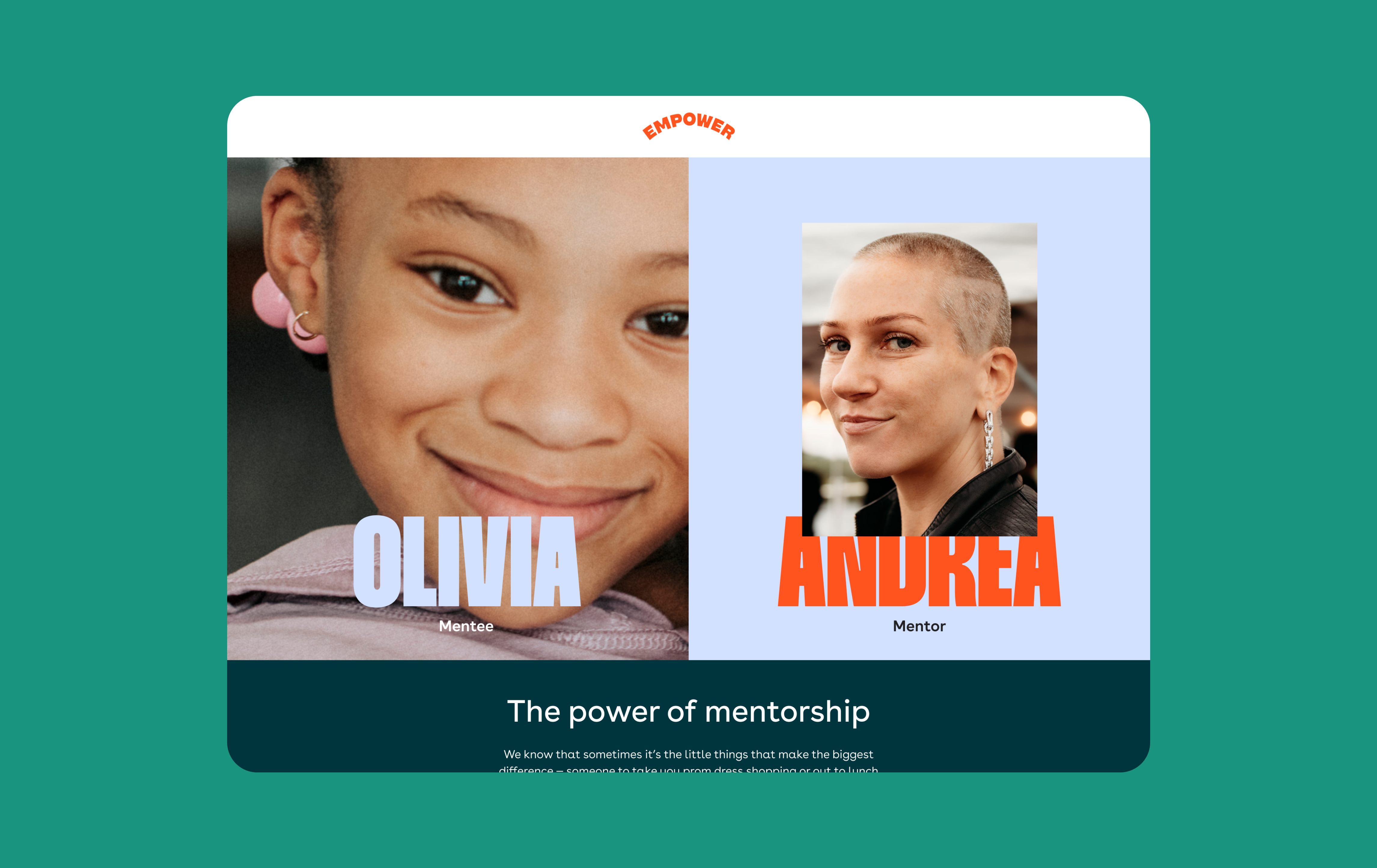
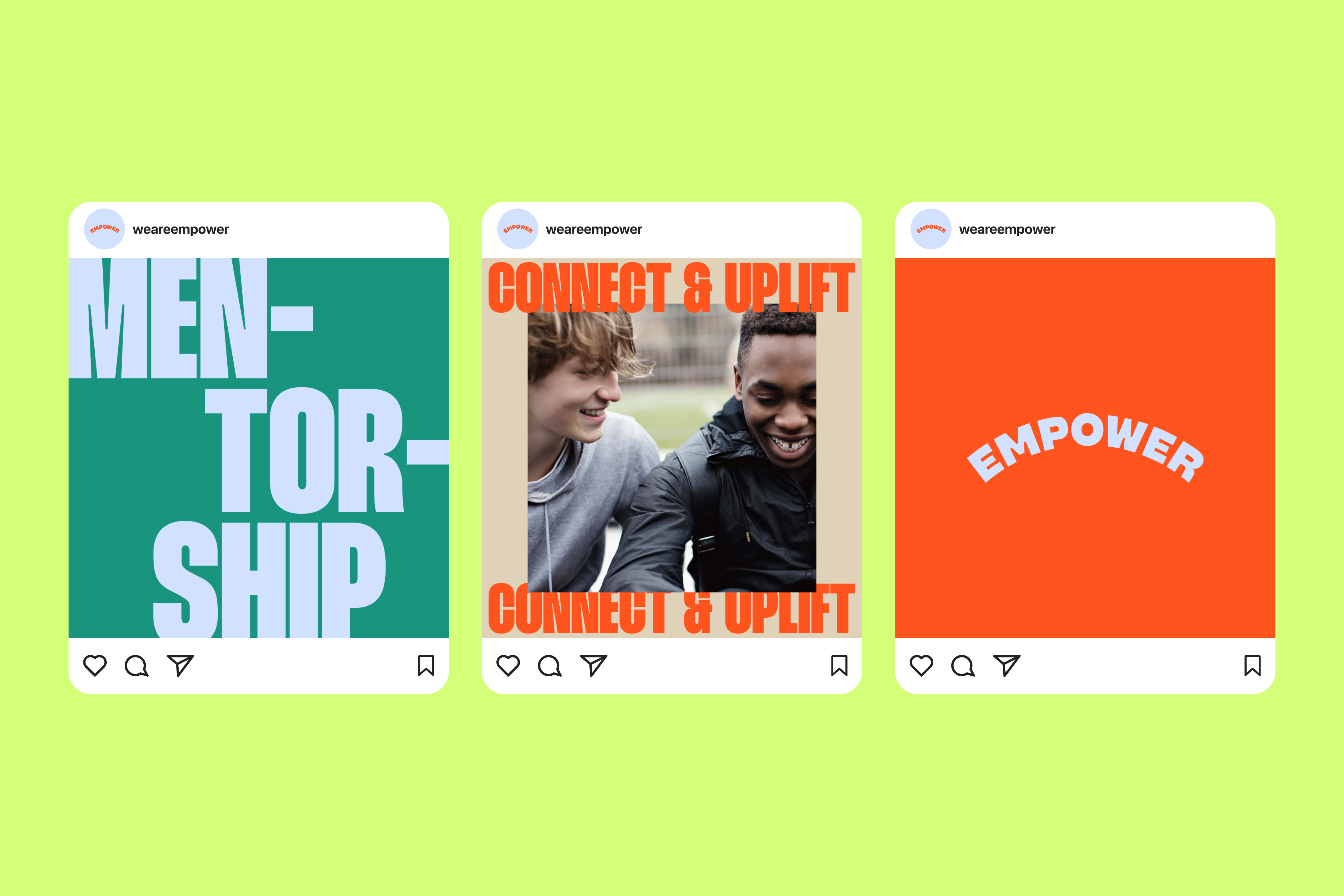
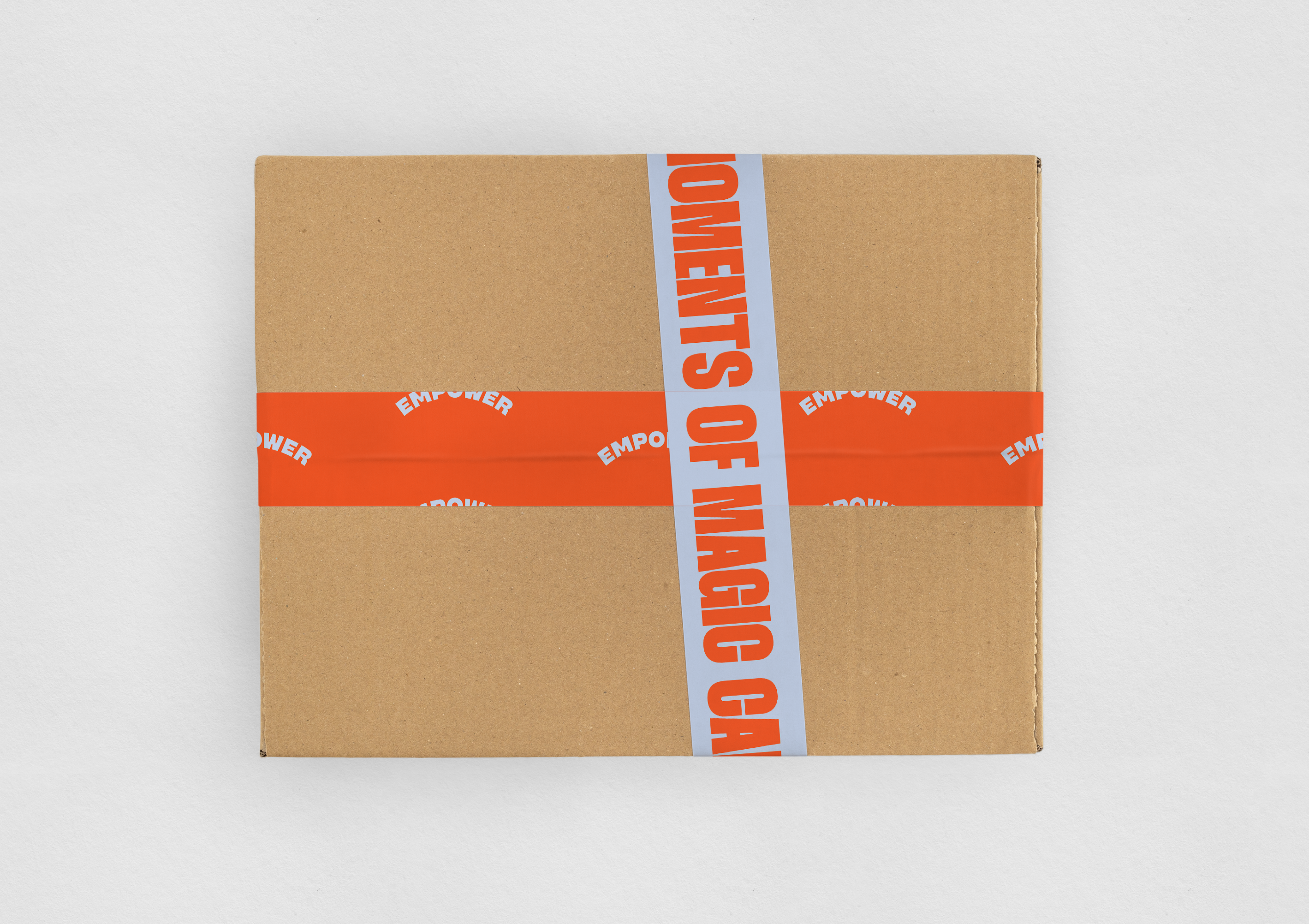
Empower is an international nonprofit that supports, connects, and empowers children and young adults who have experienced the loss of a parent. It is more than just mentorship — the sense of community and meaningful personal touches can be magical.
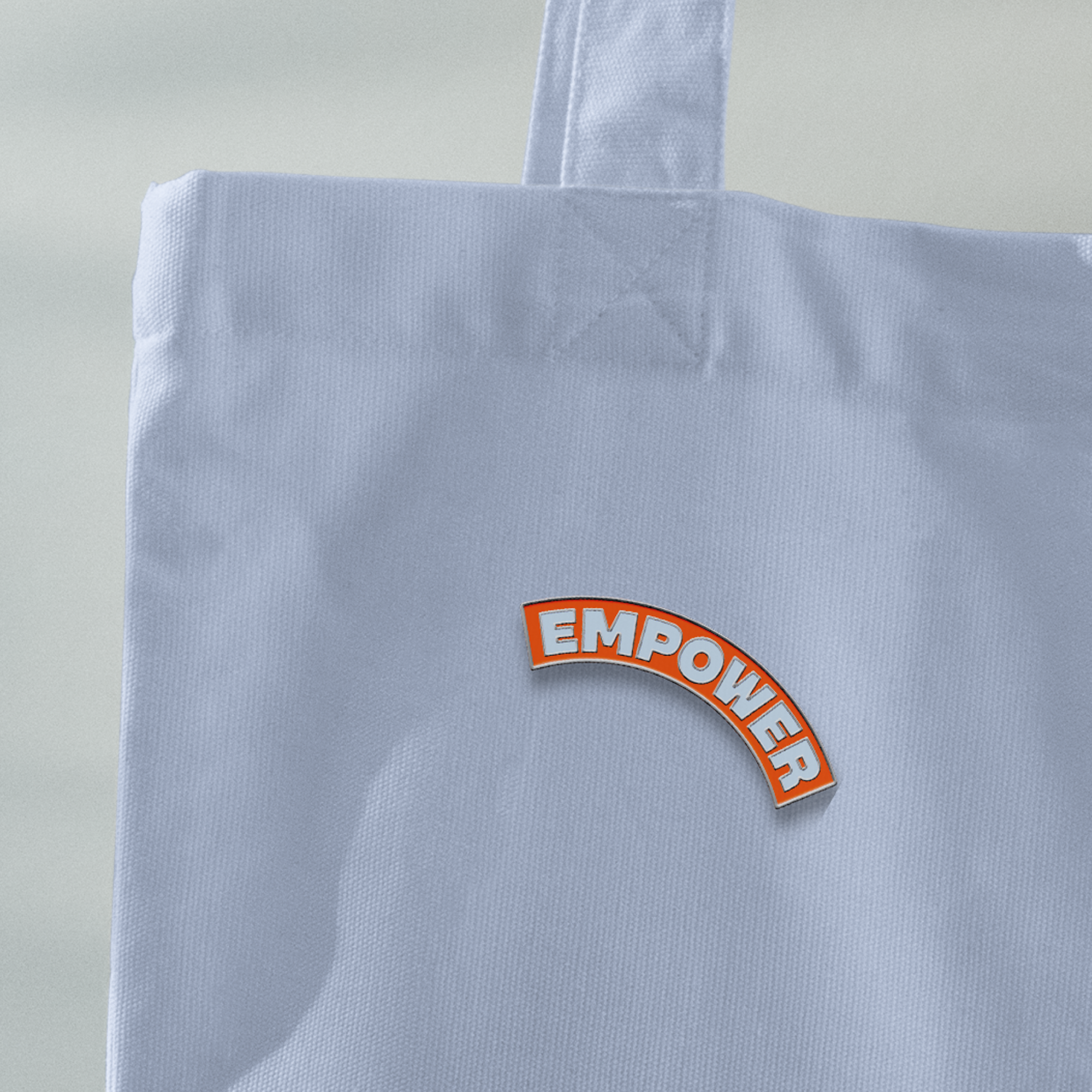
We’ve bottled the magic, the secret ingredients of passion, care, energy, and camaraderie that bring Empower’s vision to life. Framing devices and a bold, uplifting wordmark create a scalable system highlighting everyday magic moments.
I’ve worked with the Associate Director from research, concept, logo design, to developing design directions, and delivering design assets and logo animation.
Empower
Visual Identity / Motion
Agency: Team Design Studio
Role: Designer
Year: 2023
Visual Identity / Motion
Agency: Team Design Studio
Role: Designer
Year: 2023

Agency: Team Design Studio
Creative Director: Amy Globus, John Clark
Designer: Bao Hu, Stephanie Zabala
UIUX: Ioan Butiu
Year: 2023
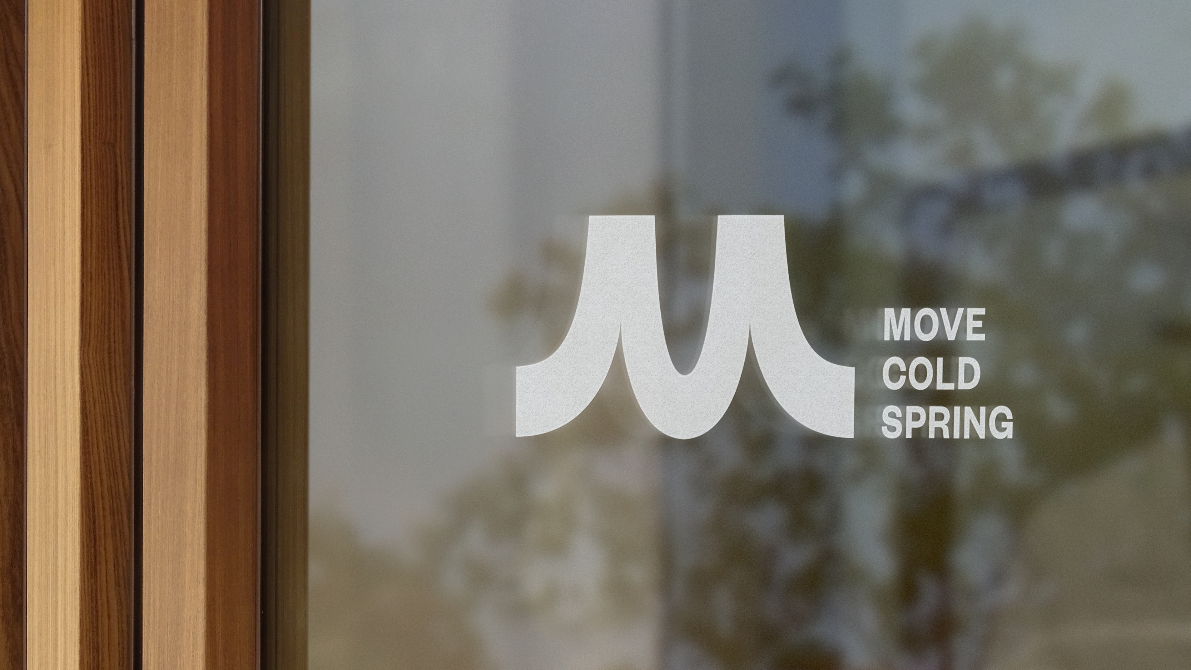
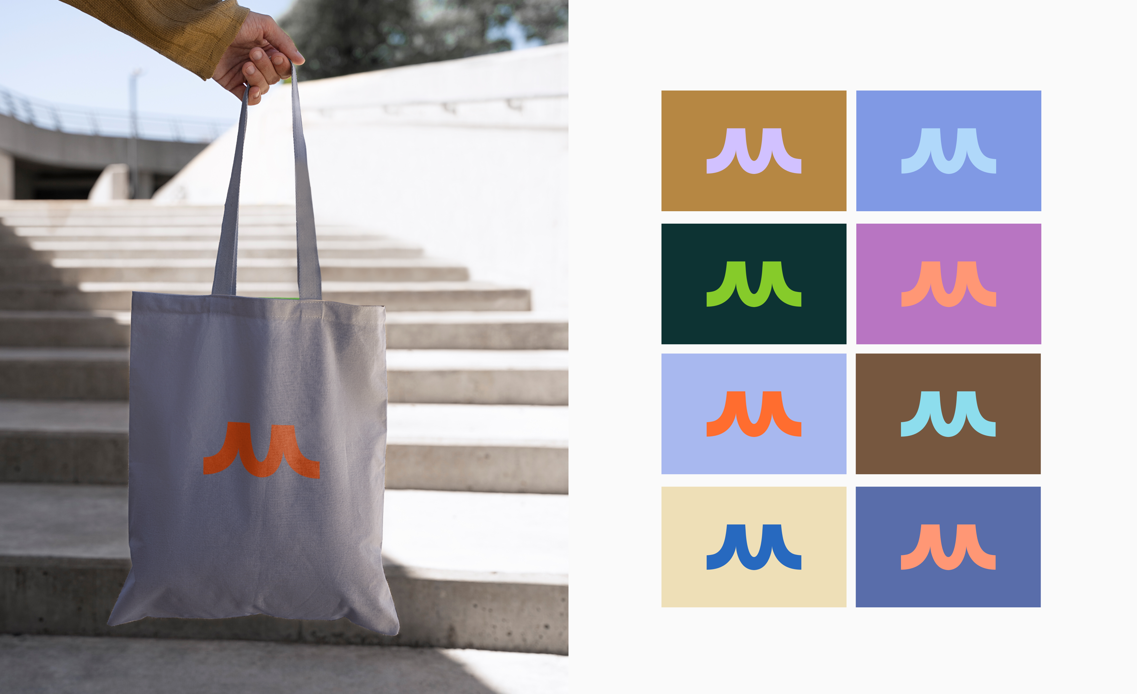
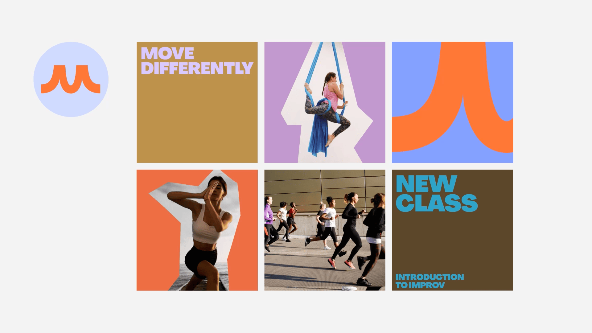
Move the body. Move the mind. MOVE Cold Spring is more than just a fitness destination; it's a vibrant hub that unites the Cold Spring community, ignites curiosity, celebrates talents, fosters education, and inspires creativity while having a blast.
The rebrand aims to bring an active and dynamic look and feel to the MOVE Cold Spring. At its core, it champions the spirit of bold movement and embraces the active lifestyles of its community members, inviting them to contribute their unique energies and expressions.
Key elements of the new brand identity include a rich and vibrant color palette, striking color combinations, bold typography, and playful and dynamic shapes. Together, these elements embody the essence of MOVE Cold Spring's vibrant and inclusive community.
MOVE Cold Spring Rebrand
Visual Identity / Motion
Agency: Team Design Studio
Role: Designer
Year: 2023
Visual Identity / Motion
Agency: Team Design Studio
Role: Designer
Year: 2023


Agency: Team Design Studio
Creative Director: Amy Globus, John Clark
Designer: Bao Hu, Stephanie Zabala, Mark Wolfe
Year: 2023
“She’s Going to Tokyo” is a digital campaign that I was fully involved in at Butter Studio. I worked closely with the art director on research, concept, visual experiments, animation, and production. The visuals express Butter Studio’s interviews with ten female Olympians, conducted at the start of the pandemic.
In April and May 2020, we interviewed 10 female Olympians (from many different sports and countries) who were planning to compete in the 2020 Tokyo Summer Games. The interviews focused on what we call the “Seven Senses,” sight, smell, taste, touch, sound, mind, and body. We wanted to know what the overlooked details of their day-to-day are, the little things that bring them joy, and their ways of finding solace in the minutia.
In April and May 2020, we interviewed 10 female Olympians (from many different sports and countries) who were planning to compete in the 2020 Tokyo Summer Games. The interviews focused on what we call the “Seven Senses,” sight, smell, taste, touch, sound, mind, and body. We wanted to know what the overlooked details of their day-to-day are, the little things that bring them joy, and their ways of finding solace in the minutia.
She's Going to Tokyo
Digital Campaign / Editorial
Agency: Butter Studio
Role: Designer
Year: 2020
Digital Campaign / Editorial
Agency: Butter Studio
Role: Designer
Year: 2020


Agency: Butter Studio
Creative Director: Cari Sekendur
Designer: Bao Hu, Mi Chen, Cari Sekendur
Animation: Bao Hu, Mi Chen
Project Manager: Nida Pellizer
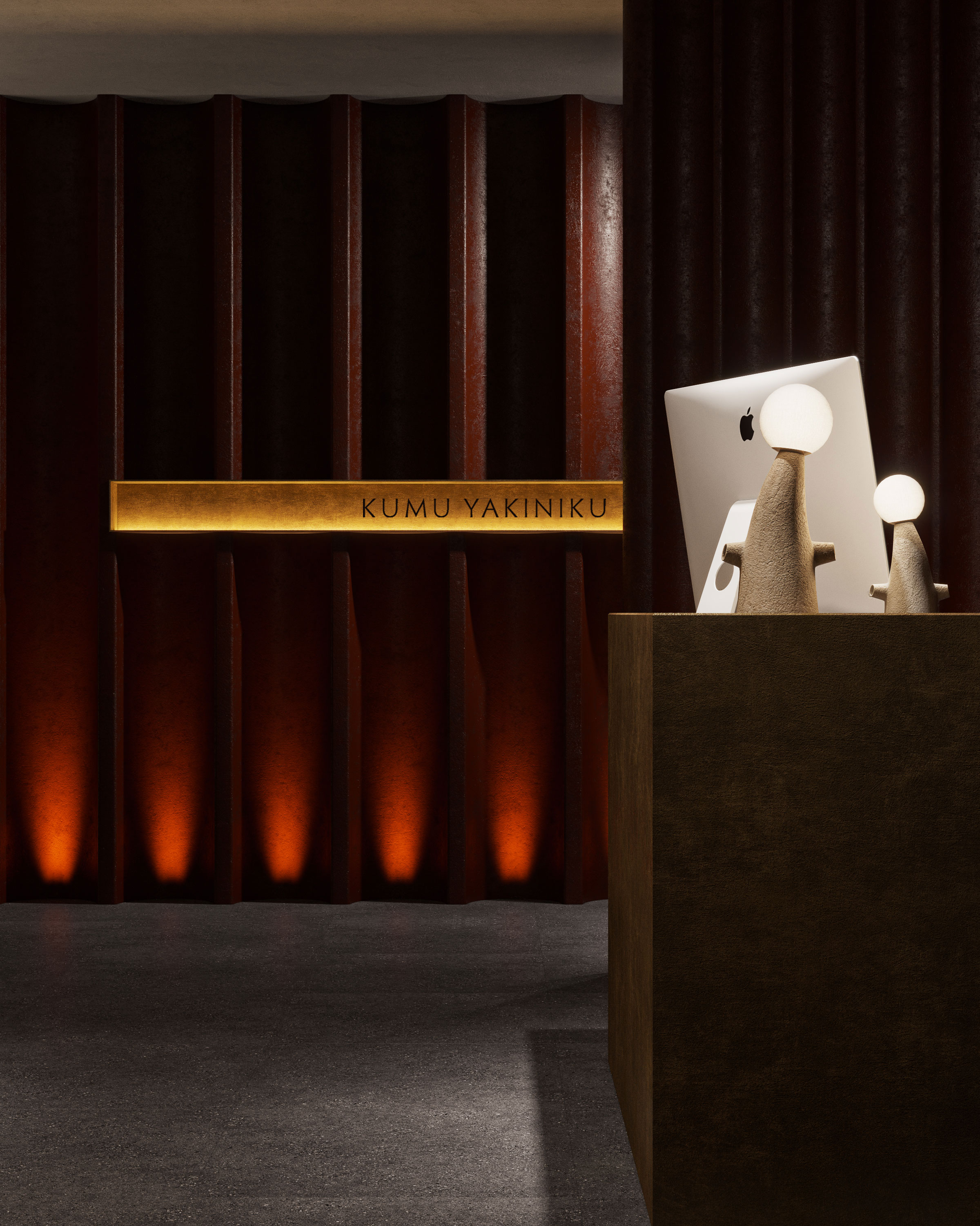
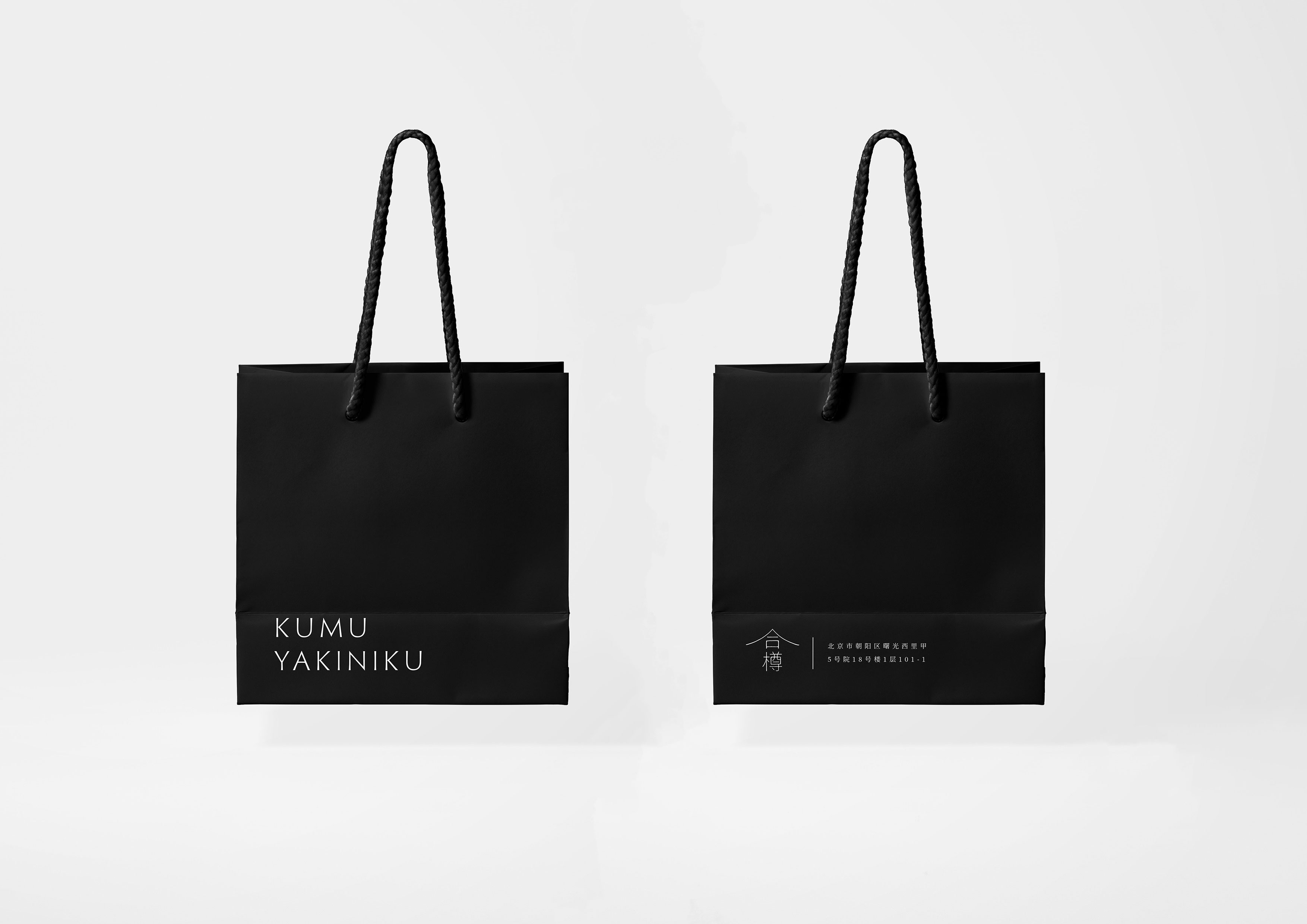
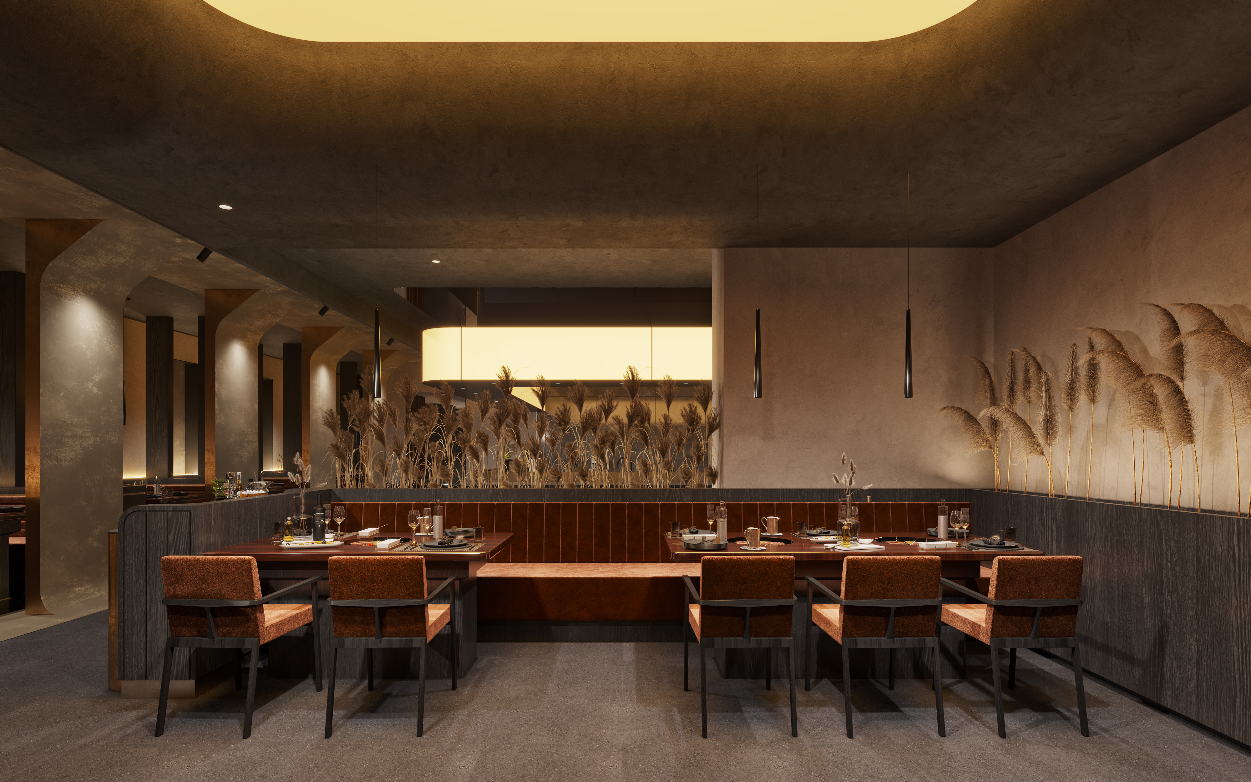
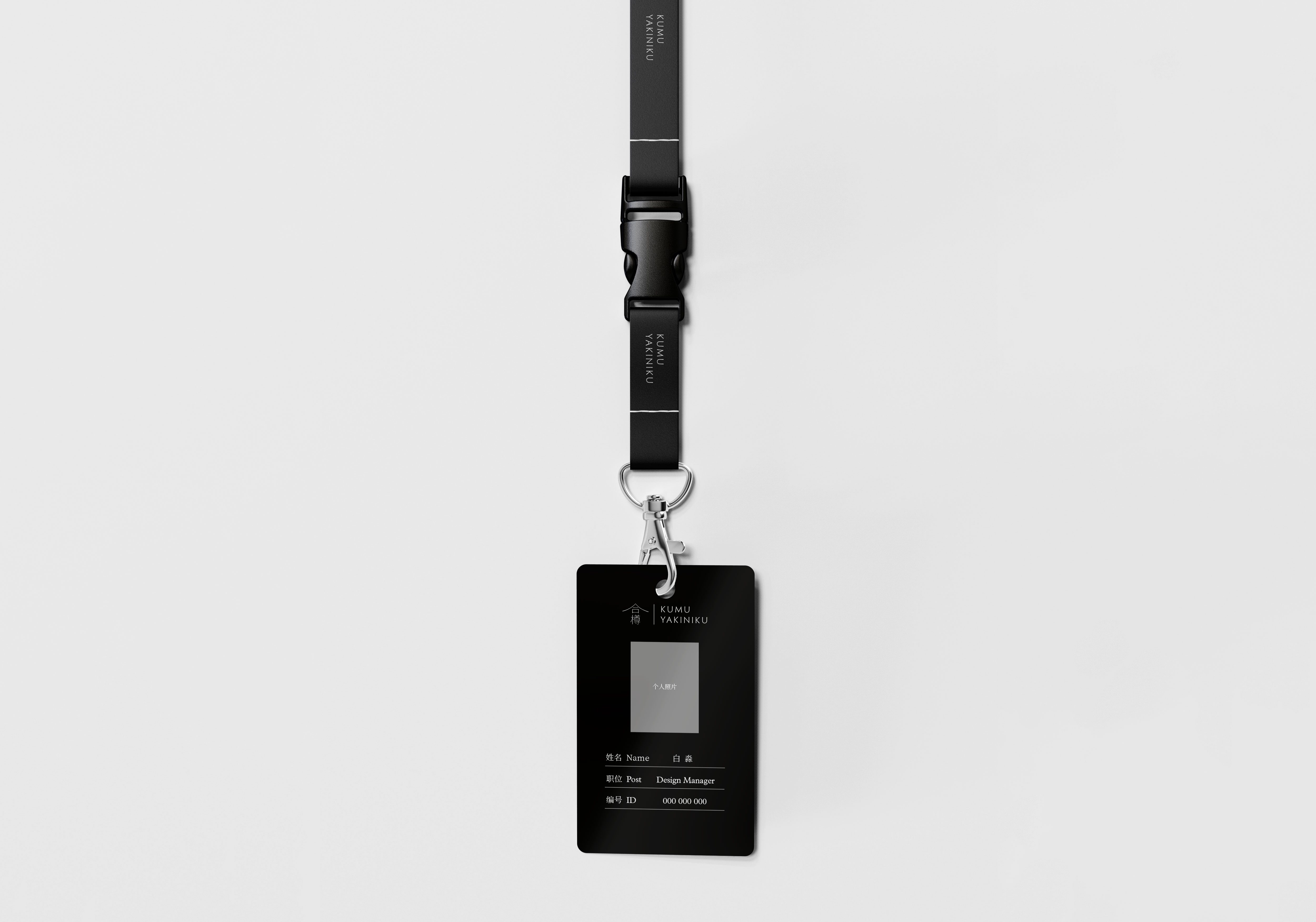
Kumu Yakiniku Lounge Izakaya is a Wagyu beef restaurant in Beijing that reinterprets Japanese cuisine with a modern twist. I worked closely with the commissioner to come to a minimal yet detailed approach, with a design system including concept development, visual identity, and environmental graphics.
Inspired by the earliest stone carvings, Kumu Yakiniku’s high-quality dining experience is expressed through bilingual custom typography. In addition, the earthy quality of the logos, with its copper-gold color and material textures, reflects the brand’s close relationship with nature.
Inspired by the earliest stone carvings, Kumu Yakiniku’s high-quality dining experience is expressed through bilingual custom typography. In addition, the earthy quality of the logos, with its copper-gold color and material textures, reflects the brand’s close relationship with nature.
Kumu Yakiniku
Visual identity
Client: Kumu Yakiniku, Beijing, China
Art Direction & Designer: Bao Hu
Year: 2022
Visual identity
Client: Kumu Yakiniku, Beijing, China
Art Direction & Designer: Bao Hu
Year: 2022

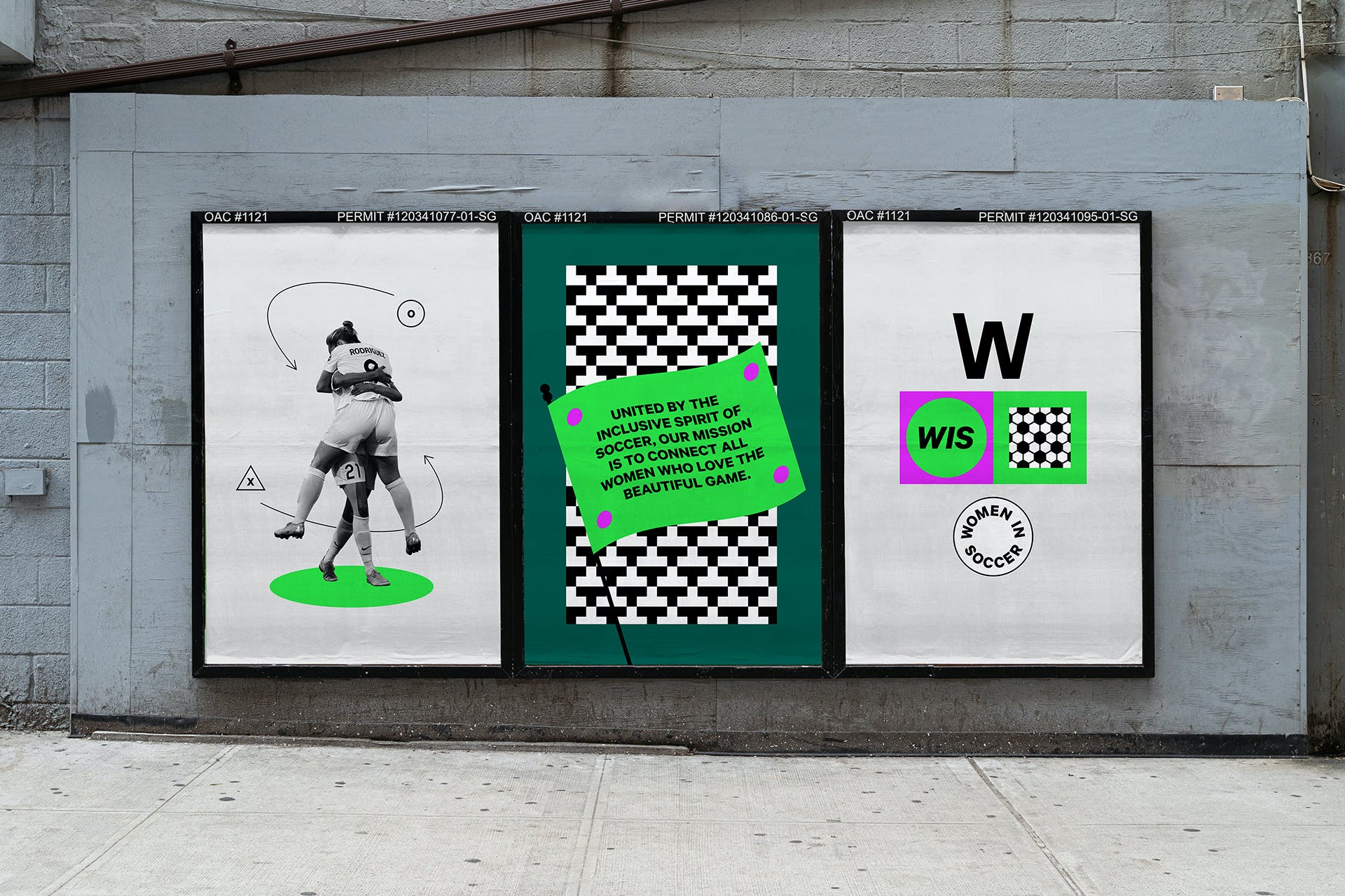
At Butter Studio, I worked on Women in Soccer(WIS)’s logo design, graphics assets, animation and web UX/UI design. WIS is a new pioneer driving equity in sports. Founded by lifelong footballer, Courtney Levinsohn, it is a professional network connecting all women in and around the beautiful game. The goal: foster equity by creating better opportunities for women in the game.
We partnered with WIS to create the face of their company: a visual identity applied to web design and marketing assets. Inspired by the aesthetic traditions of football culture—kits, trading cards, signage, team crests—we developed a design system that feels like anything but a typical non-profit. Our goal was to develop a unique personality for WIS that bridges professional with powerful and fun. The result is an identity that clearly breaks the male-dominated aesthetic prevalent in sport, asserting women’s power in the game and beyond.
Visit the website and sign up to be part of this game-changing community.
Women In Soccer
Changing the Game, Our Way
Visual Identity / UX/UI
Agency: Butter Studio
Role: Designer
Year: 2020
Changing the Game, Our Way
Visual Identity / UX/UI
Agency: Butter Studio
Role: Designer
Year: 2020
Agency: Butter Studio
Creative Director: Cari Sekendur
Designer: Cari Sekendur, Bao Hu, Mi Chen, Hannah Ahn
Web Development: Lattimore & Friends