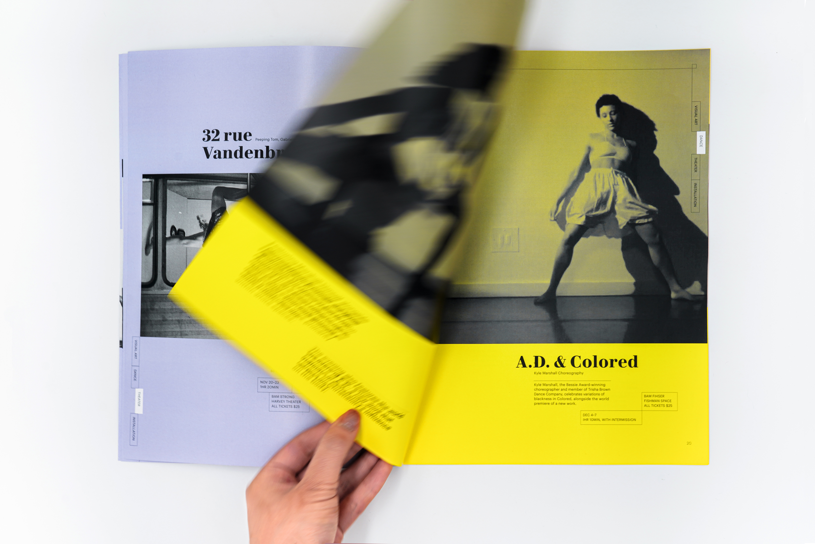
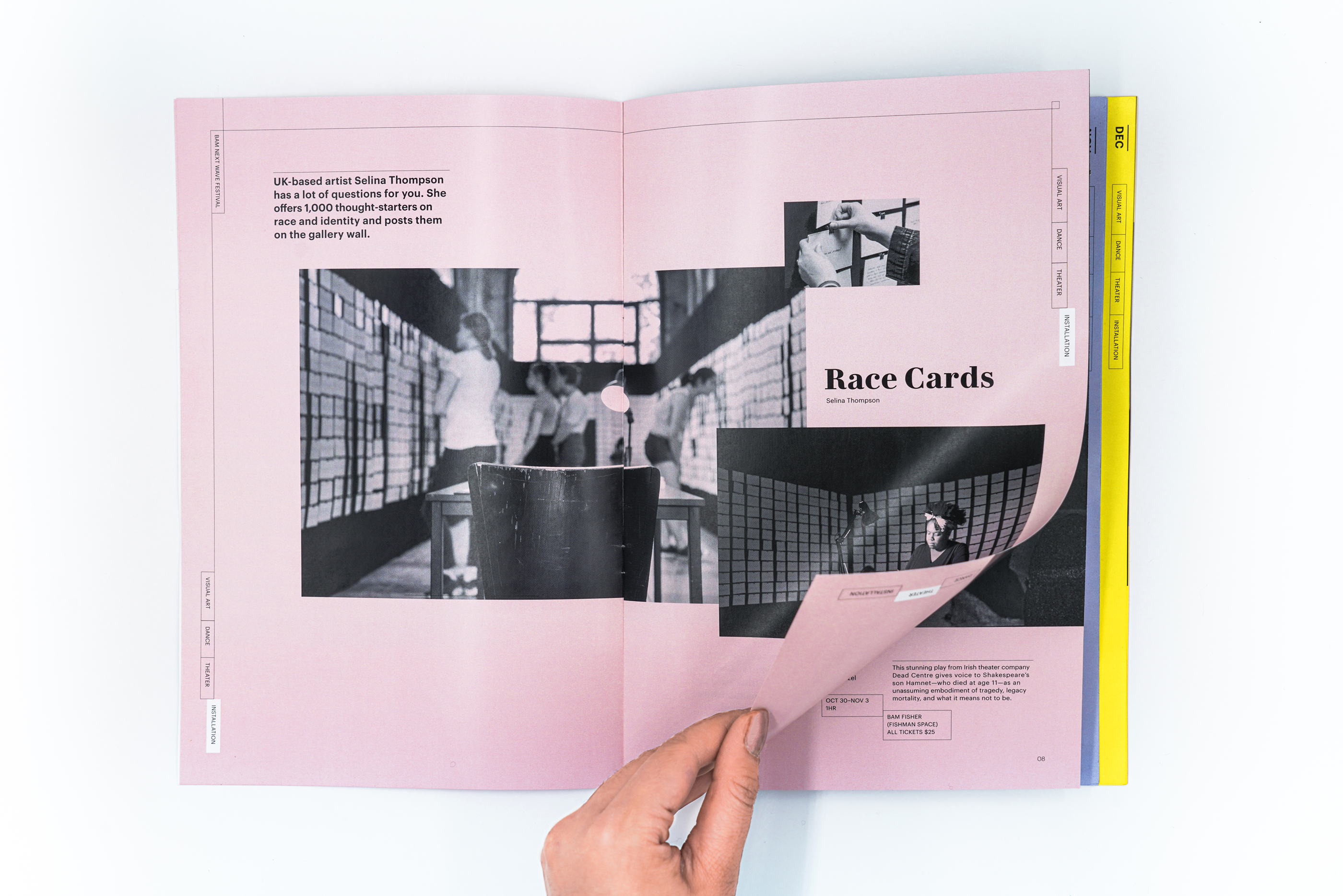
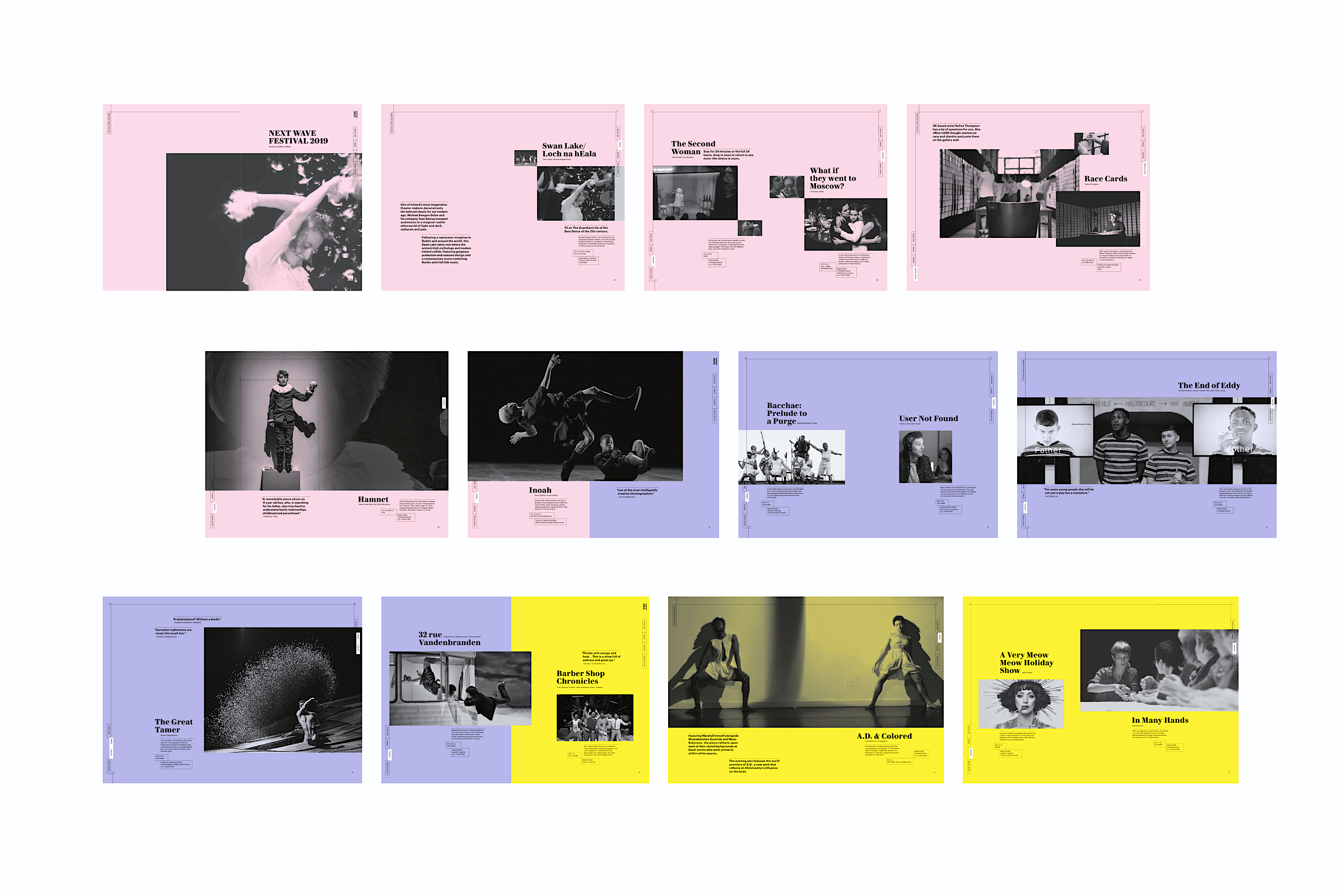
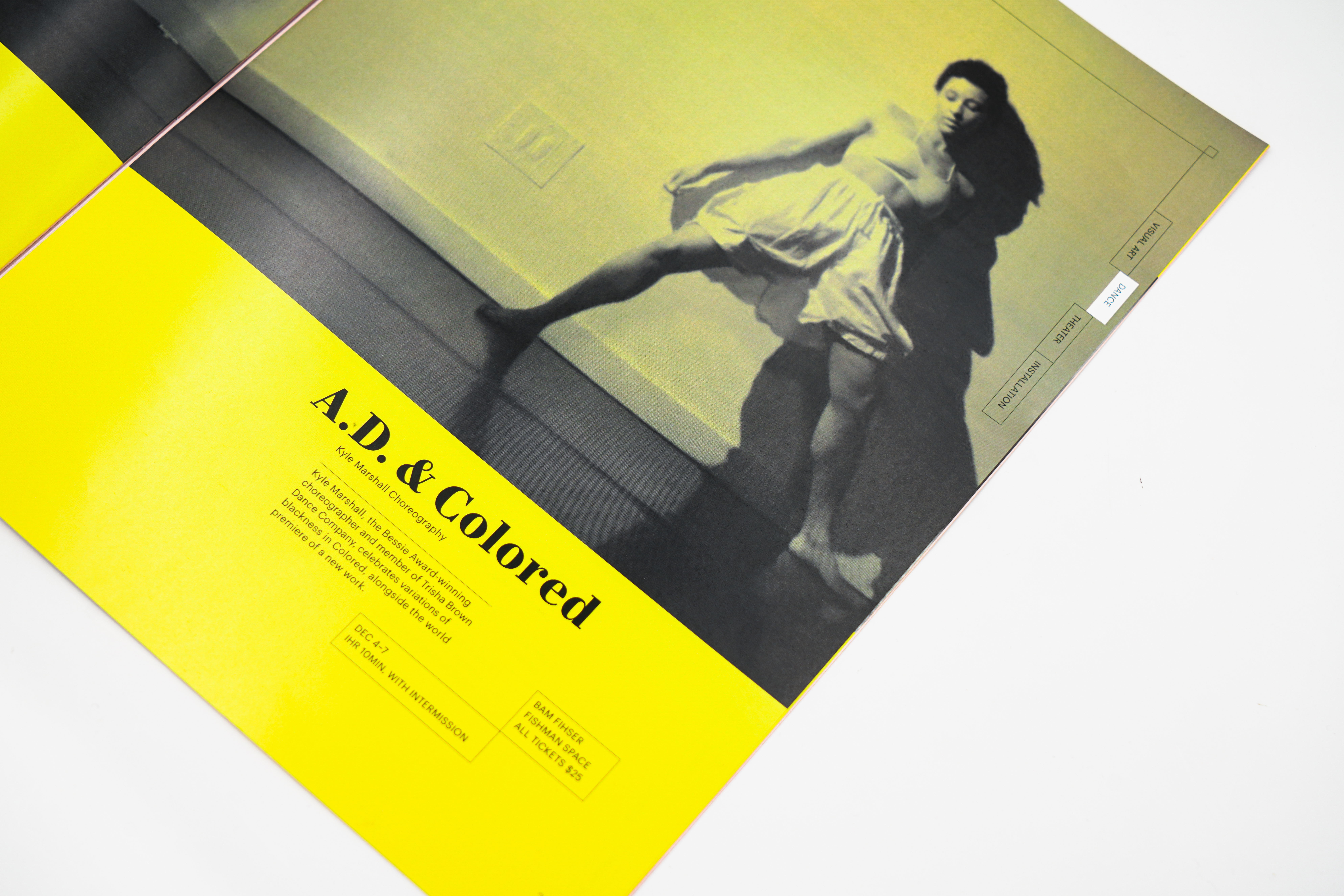
This publication is designed for the Brooklyn Academy of Music’s Next Wave Festival. In response to the festival’s spirit of innovation and artistic rigor, the brochure is developed into a three-layered sequence of dynamically asymmetric compositions with a controlled color palette. Black and white photographs serve as a subtle counterpoint, and are enlivened by a rich and crisply defined typographic system.
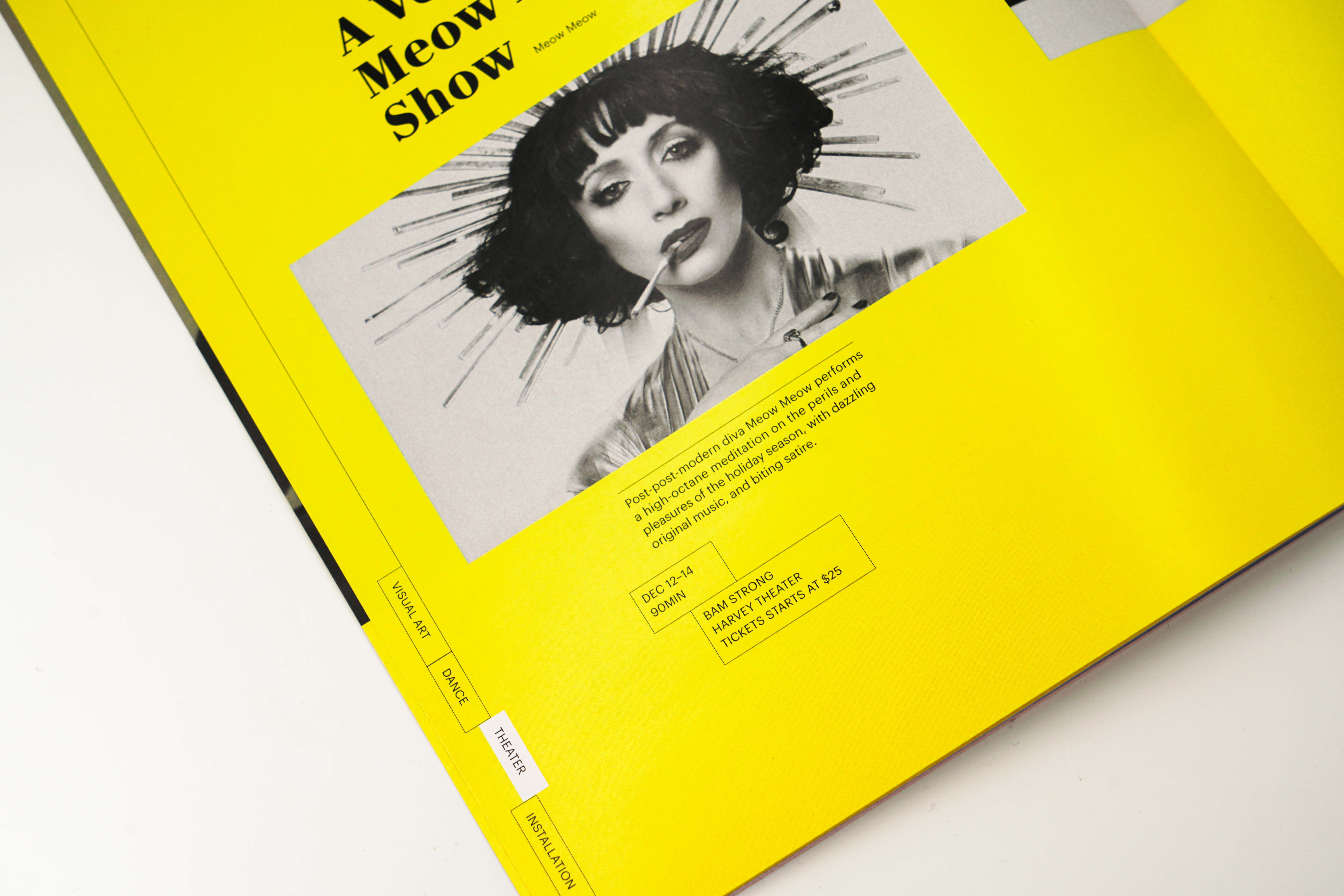
Each layer, different in both dimension and color, helps readers to navigate events more efficiently, while creating a lively and satisfying experience. Important information, such as location and time, are organized into easily accessible boxes. The solution creates an elegant balance of images and type while making order of a complex array of information.
Each layer, different in both dimension and color, helps readers to navigate events more efficiently, while creating a lively and satisfying experience. Important information, such as location and time, are organized into easily accessible boxes. The solution creates an elegant balance of images and type while making order of a complex array of information.
Next Wave Festival
Publication Design
Publication Design




Dimensions: 8 1/8 x 11
Typefaces: Le Jeune and Graphik by Commercial Type
Professor, Program Director: Jennifer Cole Phillips
Designer: Bao Hu
Typefaces: Le Jeune and Graphik by Commercial Type
Professor, Program Director: Jennifer Cole Phillips
Designer: Bao Hu